T U R N Y O U R T A B L E T I N T O A L A N D S C A P E
P O S I T I O N F O R B E T T E R E X P E R I E N C E
- CASE STUDY -
Scenery
CASE STUDY
Branding offroad rental
service company
Background
A company had been in a different type of business for a couple of years and discovered there is a potential during the off season in renting their fleet of SUVs and offroad vehicles.
SCOPE
Stratey
Concept
Naming
Messaging
Voice
Logo Design
Web Design
Challenge
Differentiate the service from travel agencies and traditional car rental companies. Attract targeted group of customers - cater to travelers in love with adrenalin and adventure and the ones who do not only want to rent a regular car when visiting new places.
Solution
Create brand identity for a new service including overal strategy and concept, name, claim and messaging, tone of voice, a logo and web design.

CASE STUDY
Our first steps
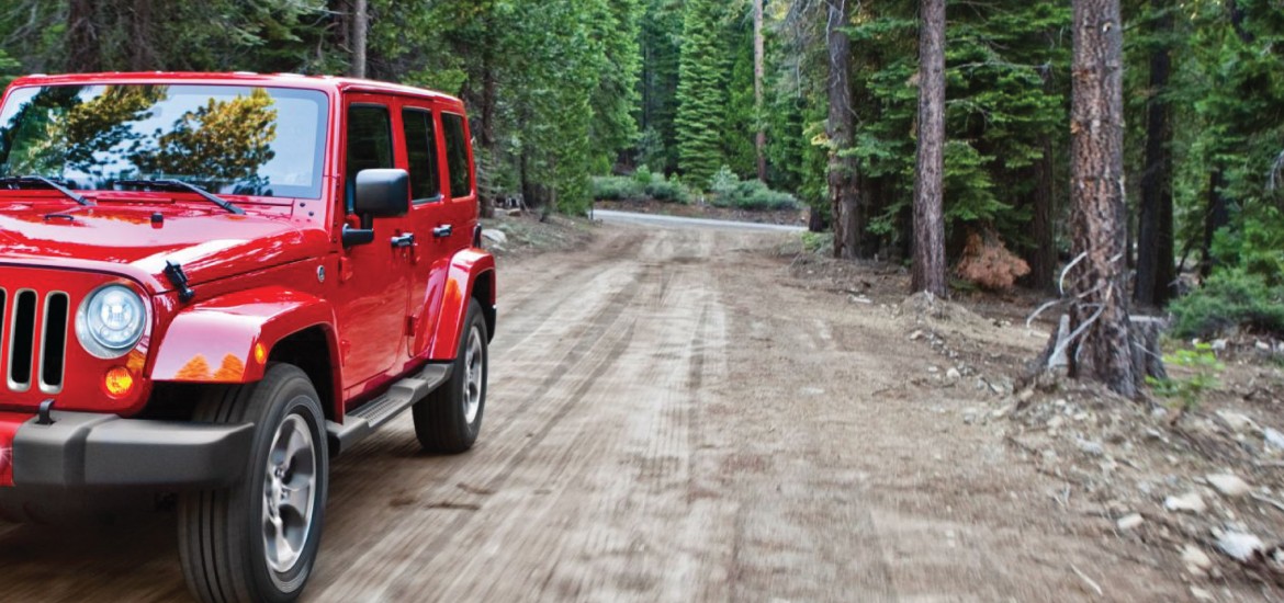
We started off with a very simple idea - to be able to create a different and relevant identity, we need to know what is so different about exploring country driving an offroad. So we rented one and did exactly that. Note: it trully is a unique experience.

CASE STUDY
Brand strategy
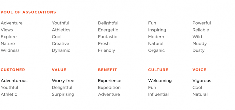
Defining a brand’s characteristics enables company to confront any kind of decision with the “DNA” of the brand - whether it is going in favor or against of who they are. Our session resulted in identifying a group of words that describe the brand’s essence the best.
Brand personality
Being clear about what the brand is about is key, as it helps people shape the way they feel - and think - about the company, it’s products and services. Based on the session, we were able to find out what type of brand personality - out of the five main types - suits the company and matches with expectations of targeted customers.

Name
Name plays a fundamental role in user experience as it is the first and the most used association connected with a company. After the initial and strategy phase, we new what feelings we want the name to evoke and all the technical details, such as lenght, language etc.
Our final pick:


"GET OFF
THE ROAD"
Voice and messaging
Once we had the name, the brand personality started to come alive. Based in the initial strategy session, we knew the tone of voice has to be full of energy, youthful spirit and outdoor adventure, yet it needs to sound welcoming, caring and reliable. Also, the messaging is supposed to cater to the adventure seekers, though it needs to reflect company’s values and reliability.
Colors
Choosing colors for brand goes beyond discussions about your favorite colors, tints and shades. Color is directly linked with what you want your company to be and how you want it to appear. We needed Scenery to appear as natural, almost rustic, dirty and not polished company, yet make it look professional and secure.

CASE STUDY
Logo design
The very first step to reflect a company into to the real world is to design a custom logo as its representation. Once we started playing with brand’s associations, we found a few promising directions and spent quite some time exploring where these were going to take us.
The final logo:
The logo design process
Logo mark itself was created with the tone we set in the first phase. It is rough-looking, industrial, even rusty and it reflects energy & power of the offroad vehicles and a unchained attitude. The “N” in the middle was turned upside down to underline free spirit of company and its customers. The overal look and feel of the logo has its foundations in the famous Jeep front grille making it look fresh but also familiar at the same time.
CASE STUDY
Web design
Website serves as a digital hub for all activities company does in a digital world but also in a real world. It is the only place where we can fully design and navigate the whole user experience. That is why we set out to create a very logical scrolling experience that feels natural and serves every important information in a bitesize piece. All images, fonts, copy and other supporting elements were hand-picked to convey basic brand characteristics: adventure, experience, power, fun. The site communicates clear call to action and serves as a reservation portal as well.


The final
design


O U R P R O C E S S
Fast & smooth.
That is how we work.

Consult and understand
your challenge

Define goals, strategy
and steps of the project.

Create all items according
to agreed timeline.

Deliver
Detailed segmentation and analysis of users
is an integral part of every single project.
+421 904 920 528


Stop selling whatever to whomever.
While marketing helps people make right decisions, branding enables them
to identify, understand, relate to and benefit from the right solution.
Partner with us and that is what you will get.
" If Capone were your boss,
you would be working
with us. "
ALL SERVICES
Branding & Identity
Web & Online Solutions
E-commerce
Professional Presentations
Social Media Management
Copywriting
Packaging Design
Print & Offline Promotion
Multichannel Campaigns
New Product / Service Introduction
PRODUCTS
The Brand DNA
Customer Journey Map
Strategic Pricing Model
CONTACT
ciao@brandetta.sk
+421 904 920 528
SK45 8330 0000 0025 0169 1072
Hlavna 108 | 040 01 Kosice | Slovensko
CASE STUDY
SCENERY

CASE STUDY
Branding for offroad
rentals service company
Background
A company had been in a different type of business for a couple of years and discovered there is a potential during the off season in renting their fleet of SUVs and offroad vehicles.
Challenge
Differentiate the service from travel agencies and traditional car rental companies. Attract targeted group of customers - cater to travelers in love with adrenalin and adventure and the ones who do not only want to rent a regular car when visiting new places.
Solution
Create brand identity for a new service including overal strategy and concept, name, claim and messaging, tone of voice, a logo and web design.
SCOPE
Strategy | Concept | Naming | Messaging
Tone of Voice | Logo Design | Web Design

Our first steps
We started off with a very simple idea - to be able to create a different and relevant identity, we need to know what is so different about exploring country driving an offroad. So we rented one and did exactly that. Note: it trully is a unique experience.

Brand Strategy
Defining a brand’s characteristics enables company to confront any kind of decision with the “DNA” of the brand - whether it is going in favor or against of who they are. Our session resulted in identifying a group of words that describe the brand’s essence the best.

Brand Personality
Being clear about what the brand is about is key, as it helps people shape the way they feel - and think - about the company, it’s products and services. Based on the session, we were able to find out what type of brand personality - out of the five main types - suits the company and matches with expectations of targeted customers.

Name
Name plays a fundamental role in user experience as it is the first and the most used association connected with a company. After the initial and strategy phase, we new what feelings we want the name to evoke and all the technical details, such as lenght, language etc.
Our final pick


Voice and Messaging
Once we had the name, the brand personality started to come alive. Based in the initial strategy session, we knew the tone of voice has to be full of energy, youthful spirit and outdoor adventure, yet it needs to sound welcoming, caring and reliable. Also, the messaging is supposed to cater to the adventure seekers, though it needs to reflect company’s values and reliability.
⇒ "GET OFF THE ROAD!"
Colors
Choosing colors for brand goes beyond discussions about your favorite colors, tints and shades. Color is directly linked with what you want your company to be and how you want it to appear. We needed Scenery to appear as natural, almost rustic, dirty and not polished company, yet make it look professional and secure.

Logo Design
The very first step to reflect a company into to the real world is to design a custom logo as its representation. Once we started playing with brand’s associations, we found a few promising directions and spent quite some time exploring where these were going to take us.
The final logo:
The Logo Design Process
Logo mark itself was created with the tone we set in the first phase. It is rough-looking, industrial, even rusty and it reflects energy & power of the offroad vehicles and a unchained attitude. The “N” in the middle was turned upside down to underline free spirit of company and its customers. The overal look and feel of the logo has its foundations in the famous Jeep front grille making it look fresh but also familiar at the same time.
Web Design
Website serves as a digital hub for all activities company does in a digital world but also in a real world. It is the only place where we can fully design and navigate the whole user experience. That is why we set out to create a very logical scrolling experience that feels natural and serves every important information in a bitesize piece. All images, fonts, copy and other supporting elements were hand-picked to convey basic brand characteristics: adventure, experience, power, fun. The site communicates clear call to action and serves as a reservation portal as well.


The Final Design


If you are looking for this kind of service let us know.
Fast & smooth.
That's how we work.
Consult and understand your challenge.
Define goals, strategy and steps of the project.
Create project according to agreed timeline.
Deliver results on time.
Detailed segmentation and analysis of users is an integral part of every single project.


It's not about selling
whatever to whomever.
While marketing helps people make right decisions, branding enables us to identify, understand, relate to and benefit from the right soluton. Partner with us and that is what you get.